
Over the past few years, many journals have implemented policies banning or discouraging the use of bar graphs for continuous data, especially in small sample size studies. This includes PLOS Biology, eLife, the Journal of Biological Chemistry, and Nature and affiliated journals. This post briefly examines what’s driving these policy changes and highlights some free resources that you can use to make more transparent graphics, whether or not you’re submitting to a journal that has a “transparent graphics” policy. Free resources and tools for creating other types of figures are also included (i.e. line graphs, figures comparing effect sizes).
Why You Should Show Your Data, Bar Naked
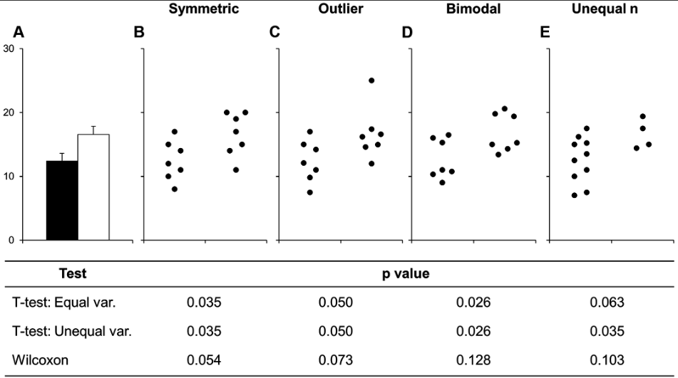
Bar graphs are actually designed to show counts or proportions, however they are routinely used to present continuous data in many areas of biological and biomedical science. Figures that show the data distribution, such as dot plots, box plots and violin plots, are rarely used. This is a problem because many different data distributions can lead to the same bar or line graph, and the actual data may suggest different conclusions from the summary statistics (Figure 1).
Figure 1: Many different datasets can lead to the same bar graph
Reprinted from Weissgerber et al. (https://doi.org/10.1371/journal.pbio.1002128), under a CC-BY license
Even if your data are normally distributed, bar graphs still aren’t recommended. Figures in scientific publications should provide information about important findings, but they should also allow readers to critically evaluate the data. Bar graphs that only show summary statistics don’t do this. Furthermore, bar graphs focus readers’ attention on the Zones of Irrelevance and Invisibility, and conceal the amount of overlap between groups.
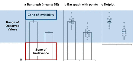
Figure 2: The Anatomy of a Bar Graph
Reprinted from Weissgerber et al. (http://www.jbc.org/content/292/50/20592.full), under a CC-BY license.
There are many resources highlighting the problems with bar graphs, including this blog post and YouTube video.
What Should You Use Instead?
More transparent alternatives include dot plots, box plots, violin plots and combinations of these plots (i.e. box plots or violin plots that show the raw data points). These plots show the data distribution and allow readers to critically evaluate the data. Which type of figure is best for your data depends on the sample size and may also depend on the data distribution. Box 1 from this paper will help you to determine which type of graph is best for your data.
Free Tools for Making Interactive Graphics
Two free web-based tools allow scientists with no programming expertise to quickly make interactive graphics for scientific publications, including dot pots, box plots and violin plots, as well as line graphs. These tools are designed for small datasets. The homepage for each tool includes is a short video tutorial.
Interactive Dot Plot Tool: This tool allows investigators to quickly make interactive dot plots, box plots, violin plots, or combinations of these plots. The tool will also create bar graphs with a warning message explaining why this is not recommended. Additional functions allow you to show subgroups (i.e. male vs. female) or clusters of non-independent data (i.e. replicates, mice from the same litter). This paper provides more information about the tool.
Interactive Line Graph: This tool works the same way as the interactive dot plot tool. The tool makes it easier to visually assess the amount of overlap between groups and examine individual-level data. You can use the tool to quickly view different summary statistics (i.e. mean and standard deviation vs. median and interquartile range), focus on groups, time points or conditions of interest, examine data for any individual in the dataset, and view change scores for any two time points or conditions. This paper provides more information.
Both the interactive dot plot and interactive line graph tools allow you to save static figures that you want to include in the print version of your paper. Saved static figures become a part of your interactive graphic file, allowing readers to explore a particular figure from the paper or the entire dataset. You can download tiff files for each saved static figure to include in the print version of the paper, as well as an xml file with data for the interactive graphic to include in the data supplement. Readers can view the interactive graphic by uploading the xml file into the web-based tool.
Creating Customized SHINY Apps: Investigators who are comfortable with R can use SHINY to create customized interactive graphics, as described in this paper.
Tool for Creating Static Figures: There are also several free web-based tools and resources for making static graphics, including dot plots and box plots. Use this list to quickly find the best tool for your data. If you have longitudinal or repeated measures data, the supplemental files for this paper (S1 text, Figures S1-S4) describe several options for creating static line graphs that show individual-level data.
Resources for Creating Other Types of Graphs
Static Graphs Comparing Effect Sizes: The estimation stats website allows users to make graphs that examine the size of the difference between groups. This approach offers an alternative to statistical tests that focus on whether groups are significantly different and helps readers to assess the potential importance of an effect.
Comparing Differences in Variability: Most statistical tests compare differences in means or medians, however sometimes scientists want to compare differences in variability (i.e. Is the range of values observed larger in males than in females?). A recent paper shows how investigators with larger sample sizes can use shift functions for these comparisons and provides R code for making these graphs.